Kāi Tahu designs incorporated in Ōtepoti central city upgrade
Mar 18, 2025

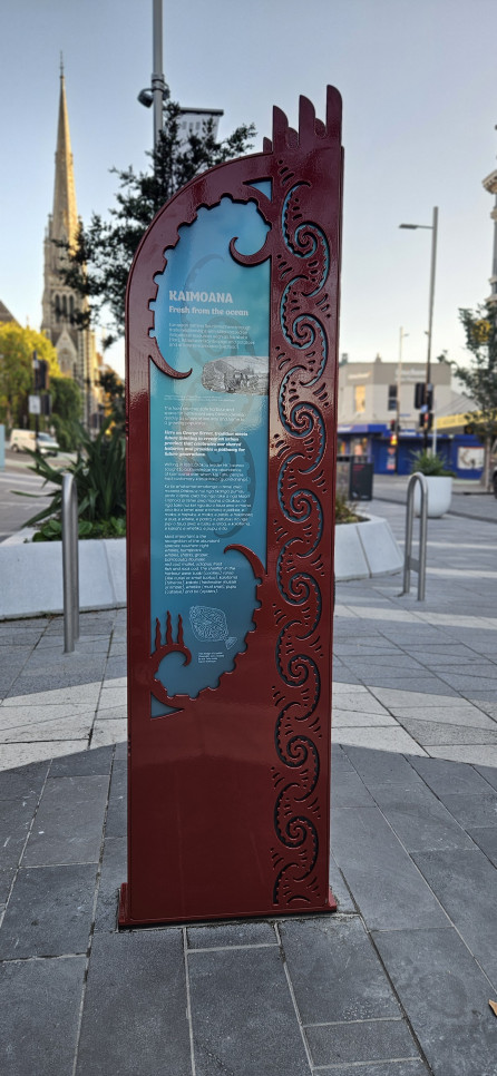
One of the tohu whenua in George St, Dunedin
The main street of Ōtepoti Dunedin, George Street, is now home to three tohu whenua or cultural markers explaining Kāi Tahu designs which have been installed as part of a project to upgrade the city’s retail precinct.
Each of these markers, which are part-artwork and part-informational, helps tell the rich, layered stories of Kāi Tahu in Ōtepoti Dunedin.
During the upgrade project, the Dunedin City Council partnered with mana whenua Kāi Tahu to define the city’s identity and convert it into a streetscape.
Directed by a mandated mana whenua panel, mana whenua owned organisation Aukaha worked with Kāi Tahu artist Morgan Darlinson to reflect the concept of Ahikā—the long-burning home fires of occupation by mana whenua.
Dr Megan Pōtiki wrote the cultural narrative for George Street that inspired the street designs.
“These tohu whenua highlight significant landmarks, original Kāi Tahu place names, and the evolving nature of the landscape, offering an insight into the carefully curated designs that feature in the George Street upgrade,” Dr Pōtiki says.
“They also firmly embed our practices, values and pūrākau (stories) into our environment, so that the next generation of Māori, Pākehā and tauiwi alike will grow up in a city that properly reflects its history and identity.”
The tohu whenua feature four key themes used in the George Street design:
• Ōtepoti – Reflecting the origin of the Māori name for Dunedin, referencing the corner of the four-cornered kete and seeking to establish a distinctly Ōtepoti/Dunedin sense of place.
• Mātauraka – Knowing mana whenua stories to gather an authentic and informed knowledge of the past.
• Mahika kai – The practice of gathering and utilising food and other important material resources.
• Kaihaukai – The traditional practice of trade and exchange.
The base colour of the cultural markers is inspired by the red at Ōtākou Marae and symbolises the link between Ōtākou Marae and the central city. Meanwhile, the ocean blue gradients represent the Otago Harbour and its ongoing influence on the city.
Project Director of the Central City Plan, Dr Glen Hazelton, says that the George Street retail quarter redevelopment had a strong focus on the inclusion of mana whenua values and design principles.
“We know that people who visit George Street have been interested in the way these values and principles have been incorporated into the street and the broader mana whenua history of the area,” Dr Hazelton says.

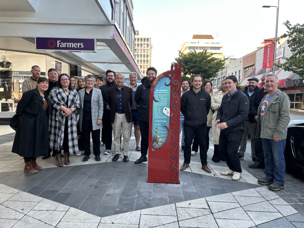
Mana whenua celebrate the installation of the tohu whenua
The tohu whenua were fabricated by local Ōtepoti businesses engineering firm Zeal Steel and steel cutting company Precision Profile Ltd and were installed on 6 March with a karakia led by mana whenua.